This is a live post from P3, the Practice Innovation Conference. This session is Data Visualization for Law Firms. I have appended the session description and speaker bio at the end of this post. [I post this as a session ends so please forgive any typos or of my misunderstandings of what speakers said.]
Data visualization is about communicating information clearly and efficiently. The world is generating huge amounts of data. Many businesses are deep into analytics and visualization. But the legal market is just now taking baby steps.
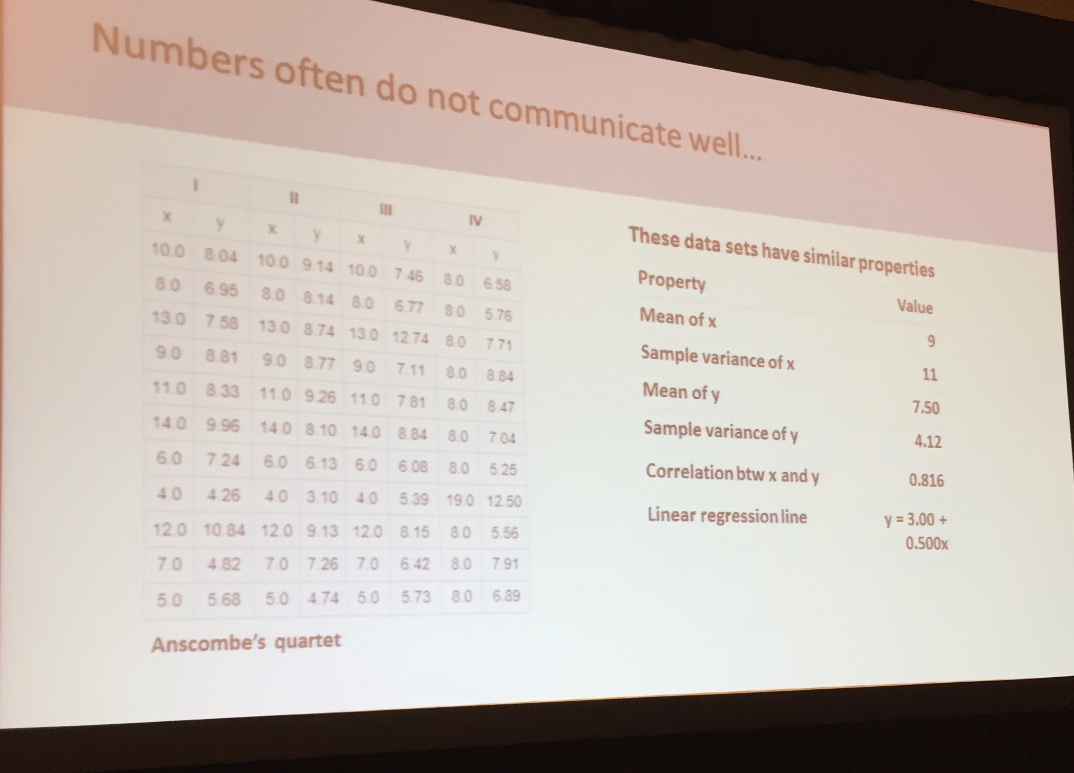
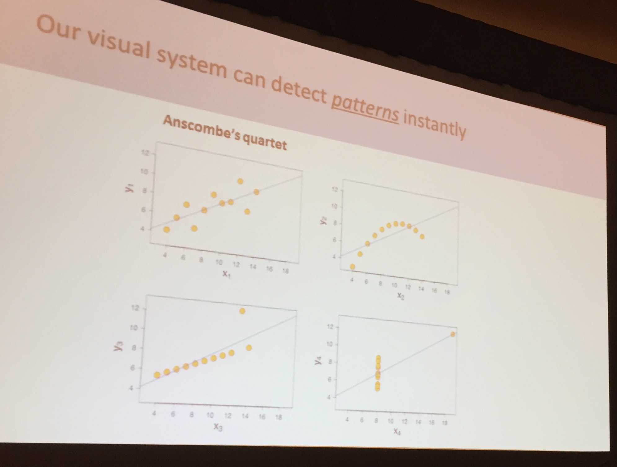
It’s very hard to read tables of numbers but very easy to read graphs. [RF: It has long driven me nuts that most in the legal market still create complex – including 2 decimals in numbers – instead of graphs.] Note the table and charts below:
Goals of visualization
- New insight
- Communication breakthroughs
- Change behavior
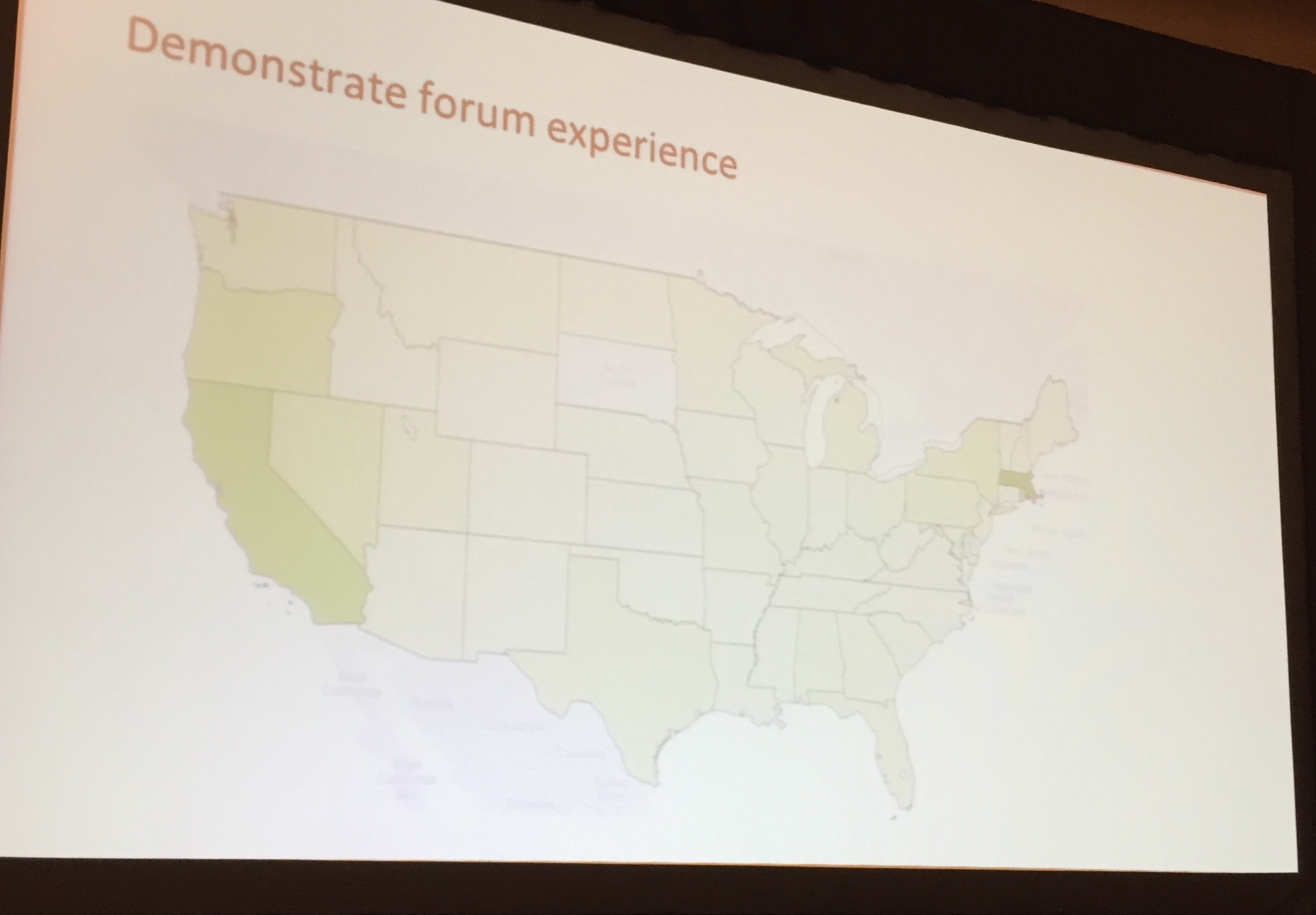
Goodwin Procter… “Forum Experience” [by the firm’s KM team]. The problem to be solved was better access to finding the experience of the firm’s attorneys. Marketing had been capturing useful data for years. But producing “slices” of the data was a nightmare – took too much time and was hard to read. From tables, the KM team led the firm to a US map display for the firm’s real estate experience. Users can click through a state to see more detailed information. In addition to a geo view, other features allow easy drill-down by property type. For client industry, the visualization is an area square [RF: called a Merimeko in some circles].
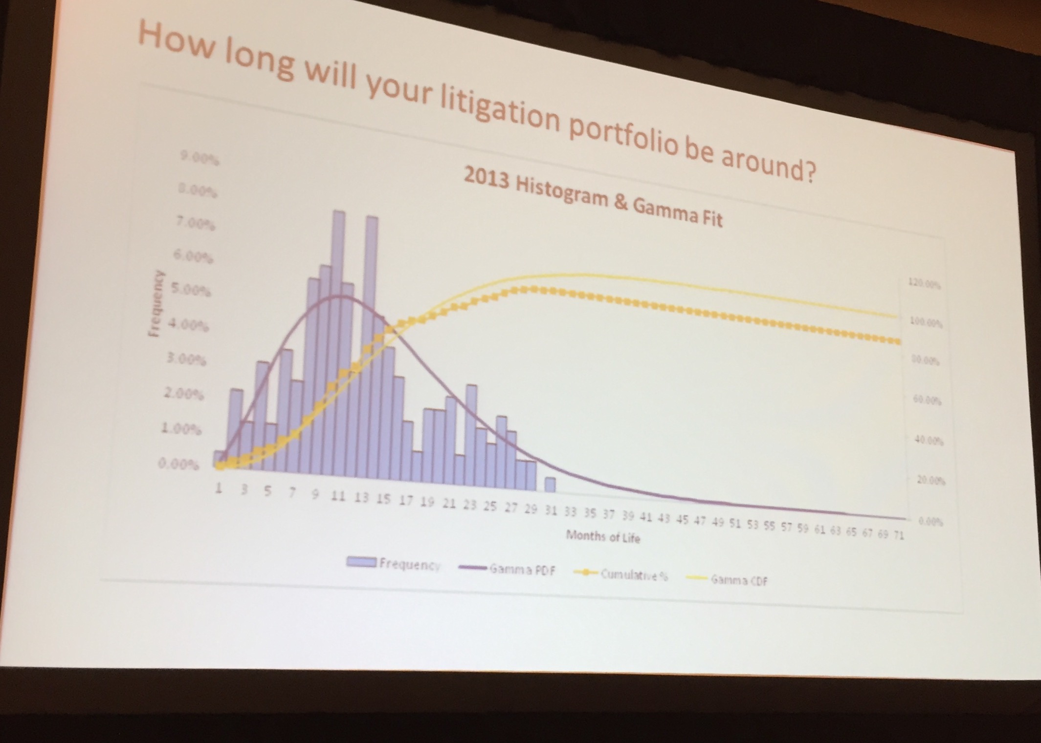
Bryan Cave… Focused on client facing data viz. Enable the client to understand the legal spend situation more quickly. Use a map to show a client spend by geography. For another slice, the firm created a 2×2 matrix of complexity versus risk with circles to show spend by region. Separately, Bryan Cave used a histogram with a Gamma Fit to predict how long a portfolio of matters will last. Also using tables with check marks as part of a KPI.

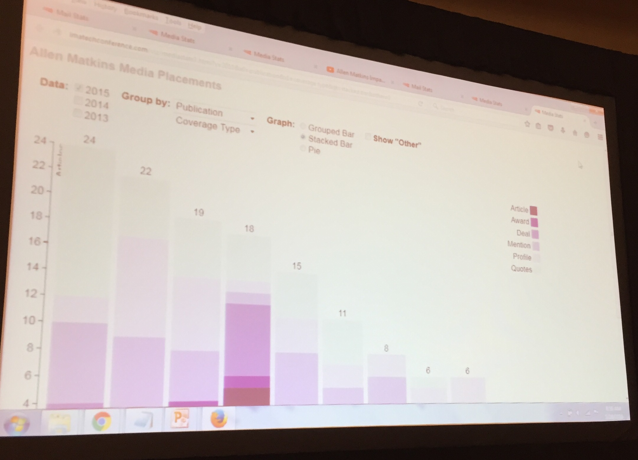
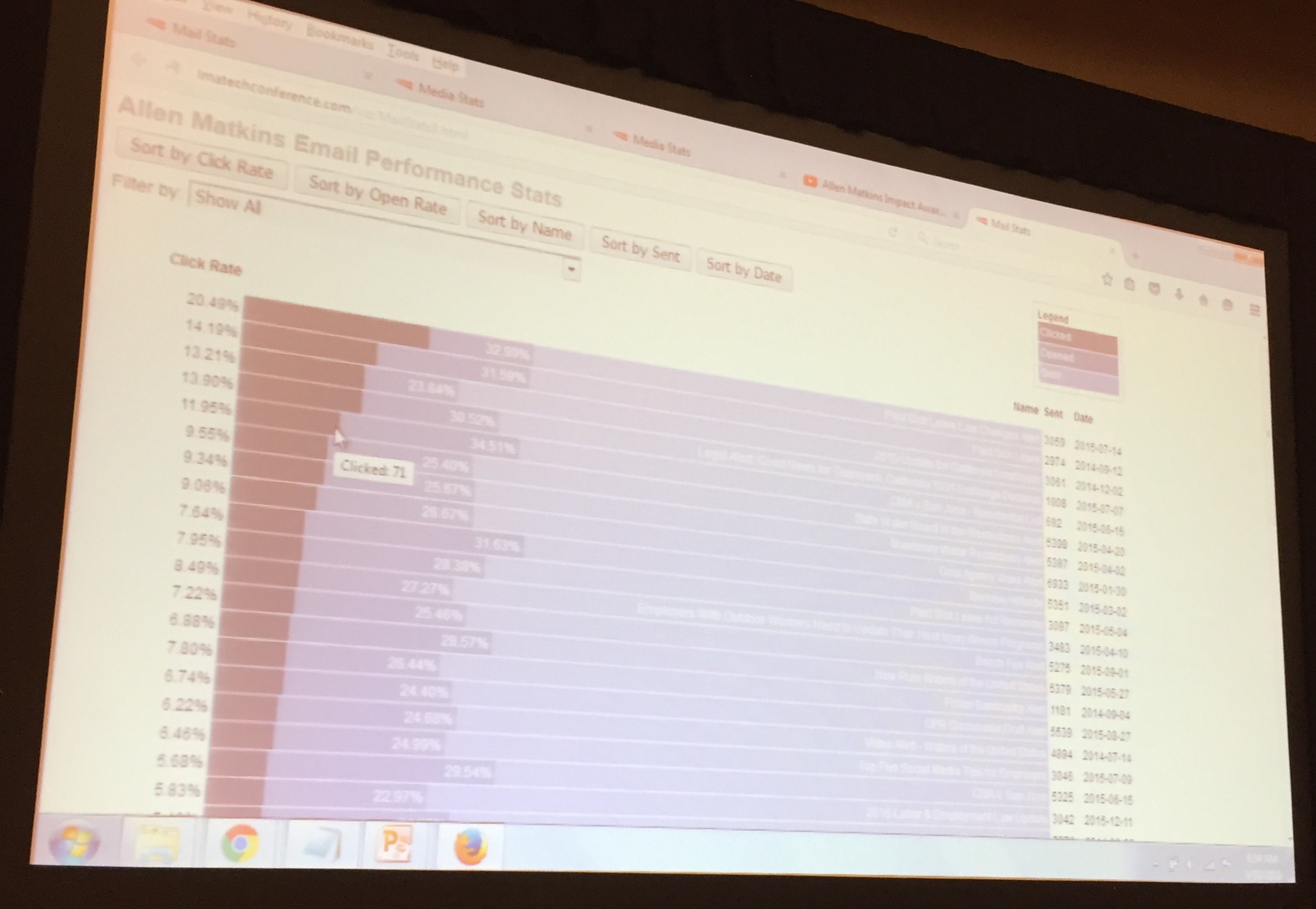
Allens Matkins marketing department shared data on effectiveness of email marketing. Produce interactive graphics that allow quick re-sort and drill down. Data informs, for example, that the subject line wording drives which email blasts are most opened. Also track impact of PR and press mentions with visualization. Used ContactNet (relationship) to map relationship between firms and clients.
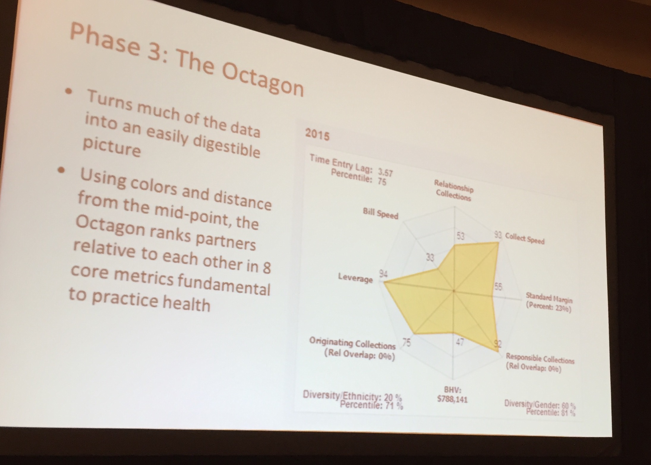
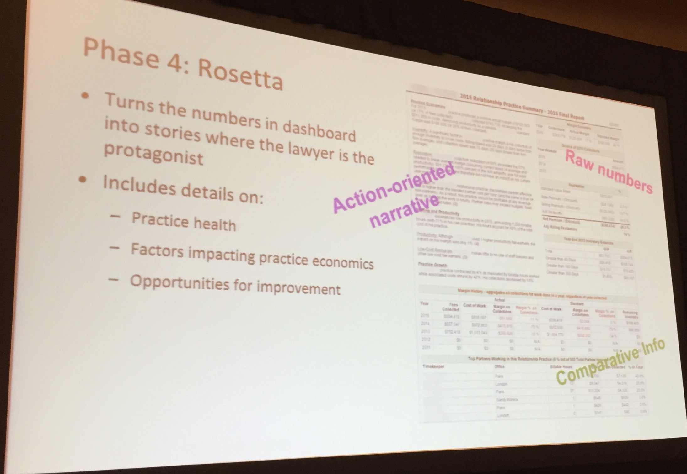
Bryan Cave on using data viz to help partners understand how to improve their profitability. This required moving partners from a focus on revenue to a focus on profit. The firm started with fairly complex spreadsheets that less than 10% of partners liked. By converting from tables to spider charts, more partners understood how to improve their profitability:

But these “octagons” (spider charts) still did not appeal to all lawyers. So the firm used Rosetta – which automatically turns data into narratives. Now, the firm can generate narratives, customized to each partner.
I ask if any of the firms have turned the tools to client data for substantive legal analysis, prevention, insight.. Not yet there.
Did not capture most of the Q&A but it revolved around tools. Several firms use Tableau but expense of it noted. Other using Microsoft Power BI.
Data Visualization for Law Firms
Speakers: Christopher Ende, Managing Director of Pricing & Project Management, Goodwin Procter LLP; Rebecca Holdredge, Manager of Practice Economics Group, Bryan Cave; and, Adam Stock, Chief Marketing and Client Services Officer, Allen Matkins
With the wealth of data that we can now collect on clients and prospects, we need new tools to understand the patterns and relationships in our increasingly information-based businesses.
Data visualization (sometimes called DataViz) is the art and science of displaying (often) large amounts of information to enable the viewer to gain insights that would not otherwise be apparent through numerical displays and spreadsheets. Data visualization takes advantage of human visual perception and cognition. For example, a human can distinguish differences in line length, shape orientation, and color (hue) readily without significant processing effort whereas, it may require significant time and effort to identify the number of times the digit “5” appears in a series of numbers.
Imagine having simple displays that show:
- the strength of your client relationships
- the industry mix of your clients
- the effectiveness of your email communications
- the jurisdictions for your different practices
- the breadth of your service to key clients
- the effectiveness of your pricing strategy
- an effective dashboard for the Key Performance Indicators (KPIs) of your business
This session explores interactive data visualization using law firm data. It shows insights that would not would not be apparent through other visual display methodologies, and it provides attendees pointers to how to employ data visualization in their everyday work.